Building & Maintaining a Design Library
PURPOSE:
I’m very excited to announce the arrival of my own design library. In an effort to expand my design skill and hone my understanding of the shared library practice and maintenance, I’ve built my own design library.
ORGANIZATION
I practiced organizing my library in a few different ways to see how I best liked to manage it as well as actively use it. I tried three different options:
creating folders by using this formatting, “Top Category/Sub Category/Content Name”
Using one page, in which held multiple named frames holding each type of component, atom, molecule, etc
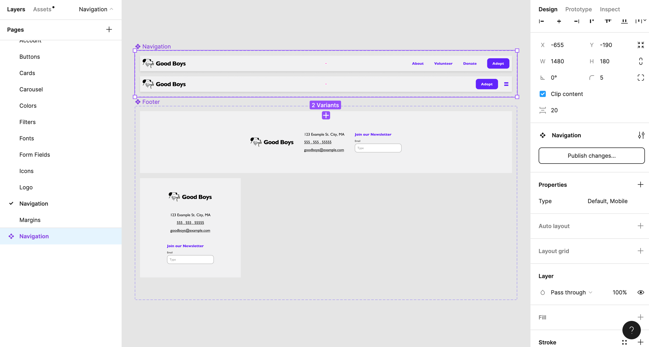
Creating a page per content type
I found that having a page per each content type was the easiest to use. This was because the folder method required too many clicks and slowed down my ability to find material, while the singular page was difficult to keep up with from a maintenance perspective - I always was rearranging or reformatting whenever I needed to add content.
PROTOTYPING
I was able to use the prototyping feature on the components themselves to enable pieces to hold their own behaviors. For example, I had the buttons set up to transition to the loading state after click, and then transition back to their original state after a timed delay post-click. This means that anywhere I plug these buttons into my flow, this behavior will come already assembled and not need to be redone in each instance.
COMPONENT STRUCTURE
Learning how to make components with a great amount of control proved challenging. I found that I could either overburden one component by adding many variants, or nest a component within another to reduce the load on my component library.
The trade off for me as a user of the working file was that I would need to click down a layer to control the nested component.
But the benefit to the organization and effort to maintain the library would be more significant, so I decided to prioritize that.
NOTE —- This is now slightly outdated due to Figma’s updates to the variants and it’s capability. Using these features you can prevent nesting almost entirely and still not bloat your component library. More to come on this soon!!
RESPONSIVE DESIGN
Having built autolayout into my entire library as well as utilizing variants where needed, I was also able to gracefully handle responsive design. This lends my files heightened flexibility, which makes adapting designs into other screen sizes nearly as fast as a click.