Case Study: Adaptation of Components into an Existing Design Library
athenaHealth, Figma
PURPOSE:
Athena’s sub-organization needed an advanced UI for table components available within their design library that will help increase the consistency of the company’s overall user experience and the efficiency of each team’s design and development processes. To make those improvements possible, the new UI table components need to be available in Figma as a central resource for designers. To do so, I created a set of range components to inform a much more extensive system of components that are going to be needed for data table.
TERMINOLOGY:
Figma - The interface design tool used at Athena by the UX Design team.
Component – A built element in Figma that contains smaller elements and behaves a certain way.
Variant – A different version of a component that users can switch between.
Detach – When a user detaches a component to edit it outside of the way it is currently built, that breaks its connection to the design library causing it to no longer update when the rest of the library updates.
BACKGROUND:
The original plan was to create two designs in Figma for range components since these were already missing from Athena’s design library.
Then, alongside the Principal Designer in my team, conduct A/B testing with my sub-organization within Athena. This would allow the designers to decide which design to move forward with, by seeing which they understood and worked better with naturally.
My deliverable also included a new dollar sign icon, which was needed to supplement the monetary use for the range component.
HOW FAILURE BROUGHT US IMPROVED SUCCESS:
Our deadline was tight but I had originally been hopefully to meet it. Once I realized it wasn’t likely, I informed the Principal Designer in my team and we came up with a new plan.
We concluded we should first test how our users, the other UX designers of Athena, were working with and understood Athena’s existing design library today - since we had originally assumed that everyone was comfortable and fluent.
Research Objectives:
What aspects/patterns do we want to keep from Athena’s Figma library?
What needs are we not addressing today? What challenges do designers face when using the existing Forge components?
How might the new Figma components provide the variations available without becoming too complex?
What architecture of the components (variant nesting, nomenclature, taxonomy, etc.) will best support designers’ mental model and workflow needs?
The User Goals:
Collector designers can design a complete table using the Collector component library.
Collector designers have confidence that their designs will be consistent with the overall Collector experience.
Novice Figma users have the support they need to build tables on their own.
Expert Figma users can take advantage of accelerators.
Research Plan:
Study 1 – Observation
Analyze data
Create new components based on our findings
Study 2 – Usability
Analyze data
Create final (ideal scenario) component
Study 3 – A/B Testing
Synthesize date to ensure final component meets success criteria
STUDY 1:
Method - Observation study
n - 6 UX/Product Designs, varied seniority levels, varied comfort with Figma
Insights -
(Confirmation) Designers use Athena’s existing component set in a variety of ways:
Start from a component and detach/customize it to suit
Use the provided component as intended
(Surprise) Designers also used components by:
Building from scratch and apply styles that match Athena’s existing design library
Assembling the simplest Forge-provided elements together to create larger components
Starting from a different, large component and revamp it to suit
All 6 users built their own components. 4 detached existing components and customized them
Naming and categorization slowed or blocked all 6 participants searching for the right components
Considerations:
The naming structure needs to match designers’ terms and account for synonyms
Designers are applying variants in several different ways, such as copy/pasting them from Athena’s design library file or clicking into the component’s layers
Build standalone components with a few options vs one component with multiple options
STUDY 2:
Method - Usability study
n - 4 UX/Product Designs, varied seniority levels, varied comfort with Figma (1 repeat from the first study)
Insights -
(Confirmation) Change in naming structure beneficial to users in switching between variants
(Confirmation) Using all-in-one component equipped with Figma’s new features proved to be difficult
1/4 Users who found all-in-one component understood how to use it
(Surprise) Not all users were able to find new Range
components
1/4 Users grabbed granular level
components
2/4 Users grabbed all-in-one component
(Surprise) Some users still opting to build own components
1/4 Users built own component
Considerations:
Need to create awareness over new components
Need to create awareness over new Figma features
How is the organization of Athena’s design library hindering users? (many users scrolling through to find desired component)
IMPACT:
Shared results of User Studies with Athena’s design library team
Help give them insight into what changes to make
They know changes need to be made, it’s just a matter of having the manpower to make them, as team is currently understaffed.
Research provided generated excitement and relief from their team, allowing them to focus on solutions for fast-to-fix issues that need minimal manpower
Dollar icon and Range Component was accepted into Athena’s design library
NEXT STEPS:
Although my time at Athena had been running out, I’m not one to leave a task unfinished. I discussed next steps and helped create a plan for the future of this project as it would be carried out with my Principal Designer. These were the steps we decided that should be carried out:
Revisit “all-in-one” component
How can we reorganize to make configuration easier?
Is it recognizable as the component users would be looking for?
Examine how to make our new components findable
What good is an “ideal” component if no one can find it?
How can we organize our component within Athena’s Figma library to make this easier?
Awareness campaign and training
Making users aware of the new component and where they can find it
Do users know about the new features Figma has added?
CONCLUSION:
Without reconfiguring our research process, we never would have uncovered so many pain points designers are experiencing. I think we went in with the assumption that we were designers and knew what the components should look like – this gave us an in-depth look into issues that need to be addressed and how we can use those observations to make more useful components for designers going forward.
Freelancing Works
Figma
I’m very excited to extend my portfolio to include some snippets of the work I’ve done - of course, without interfering with any NDAs or agreements. If you’d like more information or would like to work together, please email me directly at laur.adams63@gmail.com
SIMPLICITY DX
This particular project was one that boosted my Figma skills from novice to extremely confident, where I began utilizing many of Figma’s accelerators. This was made possible because I was hired on to help specifically for my Figma skills, so the majority of this project came down to technical skill as my project lead took on most of the stakeholder level work - however, design thinking still helped me reach some solutions I would have not have solved as efficiently otherwise.
PROBLEM STATEMENT:
How does a B2C experience management system find their new voice?
Constraints and Considerations:
absolutely NO pink or purple
Minimal product images on the home page
Wanted to create a sense of motion
wanted to maintain the same structure from their original site
RESEARCH:
Competitive research primarily dug up what they didn’t want: big white blocks of background with simple text, large sections of product images, to name a few.
Only one site caught their interest. It was unique in its vibrancy and how colorful it was, making it clear this was what they were after.
ITERATION:
Finding the right amount of color without becoming childish was a balancing act.
Without wanting pink or purple, it was hard to get a range of color in the style they were looking for. This lead me to using monochromatic gradients.
I used geometric shapes and their angles to help push the concept of motion, as well as little pixel-like elements to animate around important information to raise hierarchy.
Disagreement among the leadership team was difficult to manage at times, but I was able to navigate through excess communication, mostly handled by my project lead, as well as what essentially became an A/B voting system.
FINAL OUTCOME:
Visual Design:
We heavily relied on constant use of geometrics, layered colors to drive focus and attention as well as a tool for creating a strong sense of brand.
Where there was a break in material, I tried to sparingly use pixel-like elements to continue to focus the user on the flow to maintain the motion of the page.
My project lead also built in smooth transitions we had planned while using Webflow.
Maintenance and Building:
I built a component and style library to make the production of my designs efficient and speedy, something that became a significant asset when we were hired for phase 2 of the project.
I built this library utilizing the concept of Atomic Design by Brad Frost, having atoms, molecules, and components. For phase 2, we needed to begin delivering marketing materials and social media banners, so having branded elements already baked in to pieces ready to assemble or dissemble sped up my delivery immensely and allowed me to hit a target date that would have otherwise been too aggressive.
Design Library
Figma
I’m very excited to announce the arrival of my own design library. In an effort to expand my design skill and hone my understanding of the shared library practice and maintenance, I’ve built my own design library.
ORGANIZATION
I practiced organizing my library in a few different ways to see how I best liked to manage it as well as actively use it. I tried three different options:
creating folders by using this formatting, “Top Category/Sub Category/Content Name”
Using one page, in which held multiple named frames holding each type of component, atom, molecule, etc
Creating a page per content type
I found that having a page per each content type was the easiest to use. This was because the folder method required too many clicks and slowed down my ability to find material, while the singular page was difficult to keep up with from a maintenance perspective - I always was rearranging or reformatting whenever I needed to add content.
PROTOTYPING
I was able to use the prototyping feature on the components themselves to enable pieces to hold their own behaviors. For example, I had the buttons set up to transition to the loading state after click, and then transition back to their original state after a timed delay post-click. This means that anywhere I plug these buttons into my flow, this behavior will come already assembled and not need to be redone in each instance.
COMPONENT STRUCTURE
Learning how to make components with a great amount of control proved challenging. I found that I could either overburden one component by adding many variants, or nest a component within another to reduce the load on my component library.
The trade off for me as a user of the working file was that I would need to click down a layer to control the nested component.
But the benefit to the organization and effort to maintain the library would be more significant, so I decided to prioritize that.
NOTE —- This is now slightly outdated due to Figma’s updates to the variants and it’s capability. Using these features you can prevent nesting almost entirely and still not bloat your component library. More to come on this soon!!
RESPONSIVE DESIGN
Having built autolayout into my entire library as well as utilizing variants where needed, I was also able to gracefully handle responsive design. This lends my files heightened flexibility, which makes adapting designs into other screen sizes nearly as fast as a click.
UX Diagrams & Assets
Figma
COMING SOON! Another exciting product of my journey into the UX field is the documents and diagrams I’ve been building as I grow to learn, understand, and adapt my process around these amazing concepts.
These assets are mostly simplified versions of what is commonly found, but have become a valuable source for my memorization and practice of these concepts. I hope someone else finds them helpful as well!
Freelance project creating graphics of award trophies for new website.
Sculpture
Plaster
I was inspired from the Chicago World’s Fair. In considering feedback from a series of literal art pieces, I wanted to take a chance at experimenting with abstraction - so I wanted this piece to take time to be recognized. I broke the image of the ferris wheel down to its basic shapes rather than recreating a true replica.
Painting
Oil
In trying to refine my skills, I painted off of a reference photo of a woman floating in a field. This fantastical feeling was heightened by the medium of the oil paints.
Poster
Digital collage, Photoshop
Created a mock advertisement for Revlon by fusing the soft, delicate presence of lips with the graceful image of a calla lily. The background, intended to be of a striking balance of complement and contrast to this fusion, settles a contemporary feel.
Drawing
Colored Pencil
Meticulous attention to the fine details of the calla lily allowed me to explore the depth of this flower, using shading and blending as primary techniques.
Drawing
Charcoal
This study of motion quickly became one of my favorites and a piece of pride. Charcoal is my favorite medium, as well as life drawing, so this piece really sings to me.
It was a selected winner to be displayed in ARTeries: A Juried Fine Arts Exhibit.
Sculpture
Red clay, yarn, acrylic paint, & wire
This piece was driven from a love for Pan’s Labyrinth. El Fauno, being a slightly unsettling character, drew you in and made you constantly question his motives. In an attempt to execute that mass of emotion, I molded the clay to hold a physical depth as well as harnessed the color of the paint to boost its visibility.
Drawing
Charcoal, pastels
This piece came to me by focusing on the representation of the flowers’ mythologies.
Lilies have a history as a traditional funeral flower.
As well, Bleeding Hearts come from a Romeo and Juliet style folklore of a commoner who killed himself when he could not be with the princess he loved. This act left the princess feeling her heart would bleed on forever for him, and as such she stabbed herself in the heart to be with him in death.
The presence of these two flowers together marry the stories and their representation of innocence in death.
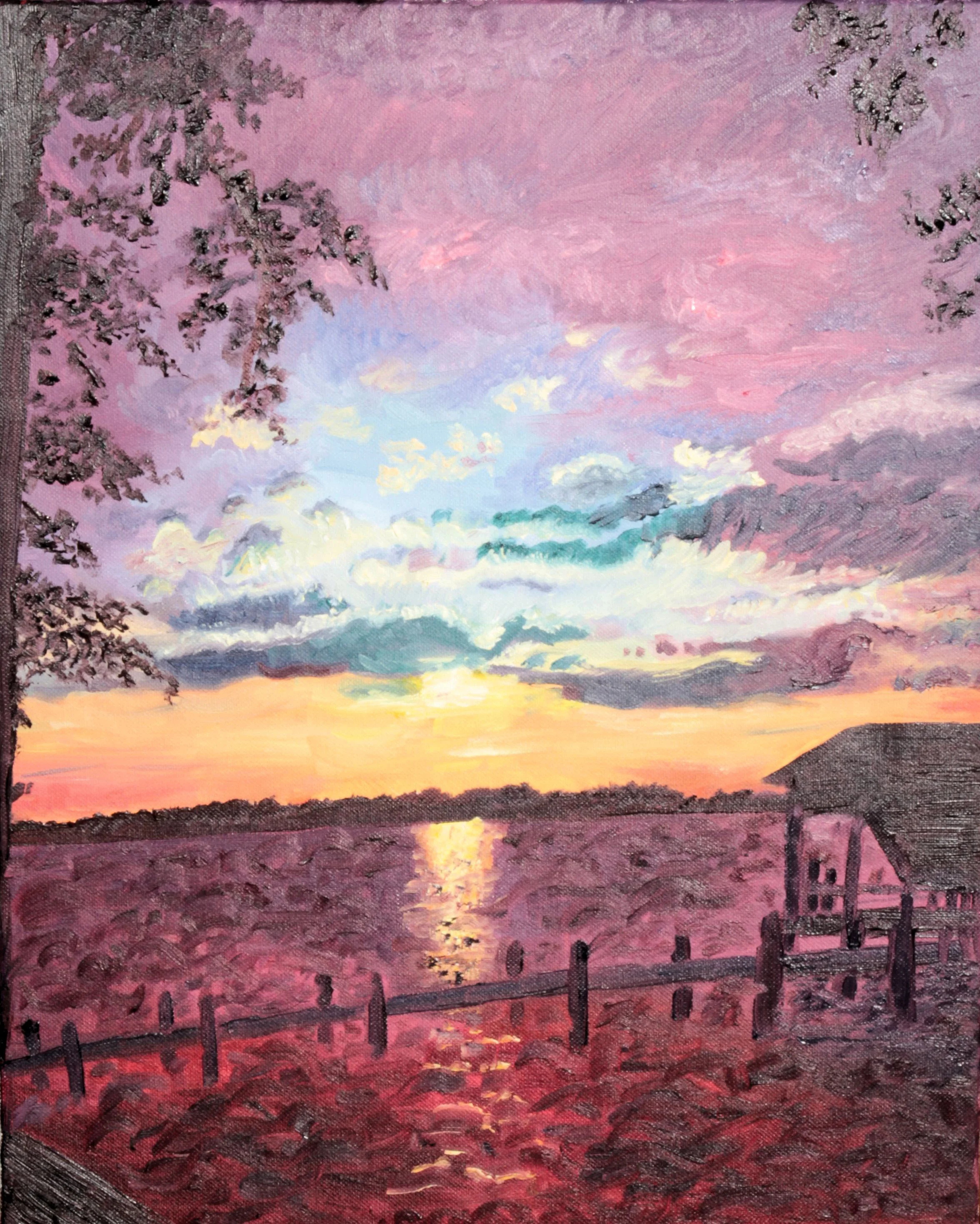
Painting
Oil
A study to explore the complexity of color, using a sunset palette that balances between warm and cold.
Drawing
Charcoal
A part of a portrait series completed of inspirational people I’ve had in my life. Kurt Vonnegut writes with a satirical tone yet holds a wholesomely optimistic meaning that influences my decisions greatly. His ability to find beauty within tragedy is something that I admire.
Poster
Ink & water, Photoshop
I wanted to visualize the way artists can see beauty in mundane or light in darkness, I crafted this piece to showcase an obvious vibrancy within the eye with a less immediate beauty surrounding it.
This piece was the selected winner for the Fitchburg State Undergraduate Conference.
Drawing
Charcoal
A simple study of planes and contrast.